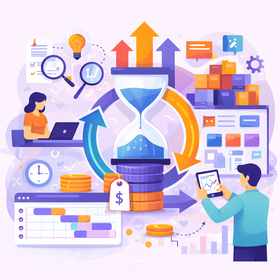
D UX Optimization to Improve Conversion Rates
Por Redacción Aguayo
In a digital world where the competition is just a click away, user experience (UX) has become a crucial factor in determining the success of a product or service. It doesn’t matter how innovative your offering is if users feel frustrated navigating your website or app.

Why Is UX the Heart of Conversion?
UX encompasses everything a user experiences when interacting with your digital product: from loading speed to the ease of finding information, and the clarity of calls-to-action (CTAs). A good UX eliminates friction, reduces uncertainty, and builds trust—three fundamental ingredients for turning a visitor into a customer.
When a website or app is optimized for UX, users feel that everything "flows." They don’t have to think too much, they don’t feel lost, and every interaction is intuitive. This not only improves satisfaction but also reduces bounce rates and increases time on site, factors directly related to a higher probability of conversion.
UX Optimization to Improve Conversion Rates
In a digital environment saturated with options, user experience (UX) has become a determining factor for the success of any online product or service. It’s not just about offering an attractive design, but about creating smooth, intuitive experiences focused on user needs. UX optimization is the key to improving conversion rates because it connects functionality with emotion, transforming visitors into loyal customers.
Why Is UX Fundamental for Conversion?
UX is not just about the appearance of an interface; it encompasses the entire interaction a user has with a product or service. From information architecture to loading speed, every detail influences how the user feels and acts. Good UX design eliminates friction, reduces uncertainty, and establishes a trust bond that facilitates conversion.
Imagine a physical store: if it’s disorganized, with confusing aisles and no clear signs, customers are likely to feel frustrated and leave. The same happens in the digital world. UX optimization seeks precisely the opposite: to ensure the user finds what they need quickly, easily, and pleasantly.
Key Principles of UX Optimization
Clarity Above All
The first fundamental principle is clarity. Users should instantly understand what you offer, how they can benefit from it, and what steps to take next. A clear design leaves no room for confusion. This is achieved through:
- Well-Defined Visual Hierarchy: The most important elements should stand out naturally. Using font sizes, contrasting colors, and strategic positioning guides the user's attention intuitively.
- Simple and Direct Language: Avoid unnecessary technical jargon or ambiguous phrases. Users want quick answers, not riddles to solve.
- Clean, Distraction-Free Design: Less is more. Excessive information or visual elements can overwhelm and divert attention from the main goal.
A clear example of this principle is successful landing pages, where the main message, user benefit, and call-to-action (CTA) are perfectly aligned without unnecessary distractions.
Consistency in Design
Consistency is the glue that holds good UX design together. Users should feel familiar with the interface as they navigate, reducing cognitive load and the learning curve. Consistency manifests on several levels:
- Visual: Consistent use of colors, typography, icons, and button styles.
- Functional: Interactions should behave predictably throughout the site or app. For example, if a red button always means "delete," it should maintain that meaning across all sections.
- Content Tone: The language and tone should be uniform, whether formal, casual, or technical.
This coherence not only improves the user experience but also strengthens brand identity, creating a perception of professionalism and reliability.
Immediate Feedback
Immediate feedback is an essential part of any interactive experience. Users need to know their actions have been successfully registered. Without this feedback, they may doubt whether their interaction worked, leading to frustration or unnecessary repetition of actions.
Examples of effective feedback include:
- Subtle Visual Changes: Such as a button changing color when clicked or hovered over.
- Confirmation Messages: “Your form has been successfully submitted” or “Product added to cart.”
- Loading Indicators: Progress bars or spinning icons that inform users the system is processing their request.
Feedback not only informs but also enhances the user's sense of control and confidence while navigating.
Mobile Optimization
We live in a mobile-first era. Most users access digital content through smartphones or tablets, so optimizing for these devices is no longer optional. A site that doesn’t display or function correctly on mobile is missing out on conversion opportunities.
Key aspects of an optimized mobile experience:
- Responsive Design: Seamless adaptation of content to different screen sizes without losing functionality or aesthetics.
- Touch-Friendly Interactions: Properly sized buttons, adequate spacing between links, and intuitive gestures.
- Optimized Performance: Minimizing resources to ensure fast loading even with slow connections.
An optimized mobile site not only enhances UX but also benefits SEO, as search engines prioritize mobile-friendly experiences.
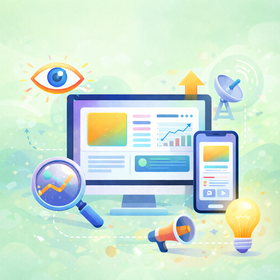
The Impact of Loading Time on Conversion
Why Is Speed So Important?
The loading speed of a website or application has a direct impact on conversion rates. A delay of just one second can significantly reduce the number of users who complete a desired action, such as making a purchase or signing up.
Modern users are impatient. If a page takes too long to load, they’re more likely to abandon it before interacting with the content. This not only affects conversions but can also damage brand perception.
Strategies to Optimize Technical Performance
- Minimizing CSS and JavaScript Files: Reduce file sizes to speed up load times without compromising functionality.
- Image Compression: Use optimized image formats and compression techniques to maintain visual quality without overloading the site.
- Using Content Delivery Networks (CDNs): Distribute content across geographically dispersed servers to reduce latency.
- Implementing Browser Caching: Store resources in the user’s browser so that subsequent visits are much faster.
Benefits of a Fast Website
A fast website not only improves the user experience but also offers strategic advantages:
- Higher User Retention: Visitors are more likely to explore and convert when the site responds quickly.
- Better Search Engine Ranking: Google considers load speed a ranking factor, which means more visibility and organic traffic.
- Lower Bounce Rates: Users stay longer on a site if the experience is smooth and fast.
In summary, speed is a critical factor in UX optimization that affects both user perception and business performance.
The Power of Microcopy and Effective CTAs
Microcopy may seem like a minor detail, but it’s actually one of the pillars of an effective user experience. These are the small snippets of text that accompany every interaction—from error messages to form instructions or button text. Despite their small size, their impact is huge because they guide, reassure, and motivate users at key moments.
What Makes Microcopy Effective?
Well-designed microcopy fulfills three essential functions: informing, reducing emotional friction, and motivating. It’s not just about saying, “Enter your password,” but about anticipating possible user doubts or frustrations and providing subtle yet clear responses.
For example:
- In an Error Message: Instead of a simple “Error,” a more empathetic microcopy would be, “Something went wrong. Please try again or check your connection.” This reduces frustration and provides clear instructions.
- In Forms: Changing “Password” to something friendlier like, “Create a secure password you can easily remember,” helps contextualize the action.
- In Long Processes: Including motivational messages like, “You’re almost there!” helps maintain user engagement, reducing drop-offs in the final step.
Microcopy is also an opportunity to inject some brand personality. A witty or friendly tone, as long as it’s consistent with the product’s identity, can create an emotional connection with the user.
Effective CTAs: Beyond “Click Here”
Calls-to-action (CTAs) are the gateway to conversion. It’s not enough to place an eye-catching button—the text and context in which it appears are fundamental to persuading the user.
An effective CTA:
- Is Clear and Specific: Instead of a generic “Submit,” try “Get Your Free Ebook” or “Start Your Free Trial Today.”
- Creates a Sense of Urgency: Phrases like “Last Days to Register” or “Offer Valid Until Today” motivate users to act immediately.
- Focuses on the Benefit: Shift the focus from the effort to the outcome. For example, instead of “Sign Up,” use “Access Exclusive Content.”
Additionally, CTA placement is crucial. It should be visible, preferably in spots where the user has already received enough information to make a decision. And yes, design matters—contrasting colors, large buttons, and effective use of white space can make a significant difference.How Information Architecture Affects Conversion
Information Architecture (IA) is the backbone of any digital product. It defines how content is organized, structured, and presented so that users can find what they’re looking for effortlessly. Well-designed IA not only enhances the user experience but also directly drives conversion rates.
The Benefits of Good Information Architecture
- Intuitive Navigation: When users can predict where to find specific information without overthinking, the experience feels smooth and natural.
- Reduced Cognitive Load: The human mind prefers predictable patterns. Clear categories, well-organized menus, and consistent visual hierarchies allow users to process information without feeling overwhelmed.
- Accessibility of Key Content: It’s not enough for information to exist; it must be placed where users expect to find it. This means highlighting best-selling products, important promotions, or action buttons without requiring endless scrolling.
The User Journey as a Map
Think of the user journey as designing a map. Every interaction point is a stop along that journey. If the map is confusing, users will get lost and are likely to leave before reaching their destination (conversion). But if the path is well-marked, with clear shortcuts to their goals, the chances of success increase.
Key principles include:
- Grouping Related Information: This helps users quickly find what they need without jumping between disconnected sections.
- Using Descriptive Labels: Instead of generic menus like "Services," try "How We Can Help" or "What We Offer."
- Effective Visual Hierarchy: Highlighting the most important elements with font sizes, colors, and strategic positioning makes it easier to prioritize information.
Emotional Design: Connecting Beyond the Visual
Emotional design goes beyond functionality and aesthetics; it aims to evoke an emotional response from users. User decisions aren’t based solely on logic—emotions play a crucial role, especially in the conversion process. A design that connects emotionally can create loyalty, trust, and a sense of belonging.
The Three Levels of Emotional Design
- Visceral Level: This involves immediate visual appeal. Vibrant colors, striking images, and attractive design instinctively capture the user’s attention.
- Behavioral Level: This refers to how the product functions. Ease of use, smooth interactions, and a sense of control influence how users feel when using it.
- Reflective Level: The deepest layer, where users reflect on their experience. Did they feel satisfied? Do they identify with the brand? This is where long-term loyalty and emotional connections are solidified.
Examples of Emotional Design in Action
- Testimonials and Success Stories: Real-life stories create empathy and social proof. Seeing that others have had positive experiences builds trust.
- Microinteractions: Small animations or sound effects when completing an action can create a sense of satisfaction, reinforcing a positive experience.
- Personalization: Showing relevant content based on user behavior or preferences makes users feel understood and valued.
Emotional design isn’t just about making things look good; it’s about creating experiences that resonate with users on a deeper level. Brands that achieve this emotional connection not only convert more but also build lasting relationships.
A/B Testing: The Science Behind UX Optimization
Optimizing UX isn’t a “set it and forget it” process. A/B testing allows you to compare two versions of an element (a page, button, or form) to see which performs better. This eliminates guesswork and provides concrete data on what truly drives conversions.
Things you can test include:
- Different colors or text on CTA buttons.
- Variations in sign-up form design.
- Changes in the order of page elements.
The key is to test one change at a time to understand which factor makes the difference.
The Importance of Accessibility in Conversion
Good UX design doesn’t exclude anyone. Accessibility ensures that all people, including those with disabilities, can interact with your site or app. This isn’t just an ethical best practice—it also expands your potential user base.
Key accessibility considerations include:
- Proper color contrasts for visually impaired users.
- Alternative text for images.
- Keyboard navigation for those who can’t use a mouse.
Inclusion creates a positive experience for everyone and can open new conversion opportunities.
Continuous Optimization: A Process, Not a Destination
UX optimization is a continuous cycle of analysis, testing, and iteration. User needs and behaviors change over time, and what works today may not be as effective tomorrow.
The ideal process includes:
- Analyzing key metrics (conversion rate, time on page, bounce rate).
- Gathering feedback from real users.
- Making data-driven adjustments, not assumptions.
Continuous improvement is the real engine behind a UX that converts.
Conclusion:
UX optimization to improve conversion rates is much more than just a design trend; it’s a strategic approach that directly impacts the success of any digital product or service. Throughout this journey, we’ve seen how every detail matters: from the clarity in content presentation to page loading speed, information architecture, microcopy that guides with precision, CTAs that inspire action, and emotional design that authentically connects with users.
The true power of UX lies in its ability to eliminate friction, anticipate needs, and build experiences that are not only intuitive but also memorable. It’s not about applying a magic formula, but about deeply understanding users, listening to their behaviors and emotions, and continuously adjusting the product based on concrete data.
Moreover, we cannot overlook the importance of accessibility as a fundamental part of inclusive UX that leaves no one behind. Designing with user diversity in mind is not only ethical but also opens up new conversion opportunities.
UX optimization is an ongoing process—a dynamic cycle of learning and constant improvement. There’s no finish line because user expectations evolve, technologies advance, and behaviors change. That’s why the approach must be flexible, based on experimentation (like A/B testing), real user feedback, and adaptation to new trends and needs.
Ultimately, UX isn’t just about improving conversion rates. It’s about creating experiences that make users feel they’ve come to the right place, that they understand what’s being offered, that they trust the brand, and most importantly, that they want to come back. That’s the real impact of well-optimized UX: building lasting relationships beyond the initial conversion.