Aguayo

D Microinteractions: Small Details That Make a Big Difference in UX

Por Redacción Aguayo

Designing microinteractions isn’t an aesthetic luxury — it’s a powerful UX strategy that communicates, guides, and emotionally connects with the user.

ux_microinteracciones
CAPTION: Photo generated from Midjourney

Small Details That Make a Big Difference in UX

In digital design, large concepts like information architecture, interaction design, or accessibility usually get all the attention. But there’s a subtle, almost invisible component that makes a dramatic difference in the user experience: microinteractions. These are small actions, often imperceptible, that bring an interface to life. A visual response when tapping a button, a gesture confirming your file has been uploaded, an animation indicating something is in progress. These are moments that communicate, guide, and emotionally connect with the person navigating your product.

What Are Microinteractions?

Microinteractions are brief and specific events designed to accomplish a single task within an interface. While they may seem simple, their true value lies in how they contribute to the ongoing dialogue between the user and the system. They’re not superficial decorative layers — they’re the non-verbal language of digital interfaces.

They’re present in every corner of the experience:

  • When you hit “like” on a post and the icon momentarily transforms

  • When a button changes color on hover

  • When a subtle notification lets you know something went right (or wrong)

Microinteractions:

  • Focus on a single purpose: providing feedback, aiding navigation, preventing errors, or simply delighting the user

  • Are functional and communicative, not ornamental

  • Generate positive emotions because they show the interface is “listening”

And although their size is small, their impact is significant. They shouldn’t be left as a last-minute design addition. Their absence can make a system feel cold, rigid — even broken. Their presence, when well designed, brings closeness, clarity, and flow.

Why Are They So Important?

At their core, microinteractions are the bridge between functional design and emotional experience. They’re the digital equivalent of a smile when being greeted, a “thank you” after helping, or a subtle signal that everything is working fine. They humanize technology.

When a system responds to user actions in an immediate and precise way, it builds a relationship of trust. The user understands that what they do has an effect — the system feels “alive.”

Key Benefits

  • Reduced cognitive load: A system that behaves as expected doesn’t need to be explained. Microinteractions replace long instructions with intuitive cues

  • Reinforcement of positive behaviors: A subtle animation after completing a task provides satisfaction and may even encourage repetition

  • Improved perception of quality: An interface that responds smoothly and clearly conveys professionalism, even if the backend logic hasn’t changed

A well-designed microinteraction can be the difference between an app that’s abandoned and one that’s loved. It can turn a routine task into a satisfying experience. But a poorly designed microinteraction — slow, confusing, or unnecessary — can produce the opposite effect: frustration, confusion, and drop-off.

Common Types of Microinteractions

Microinteractions are everywhere. While each product can design them according to its brand personality, there are common patterns that tend to repeat due to their effectiveness.

Frequent examples include:

  • Button animations: color changes, shadows, or vibrations that signal the action was received

  • Loading indicators: animations that show the system is working, preventing the user from thinking it froze

  • Subtle notifications: visible confirmations after actions like saving, deleting, or submitting

  • Navigation transitions: smooth movements between screens or elements that guide the user without needing menus or instructions

  • Real-time form validation: automatic alerts that prevent errors before submitting a form

These feedback mechanisms not only clarify system status — they also serve as opportunities to reinforce brand identity, tone of voice, and emotional engagement with the user.

Microinteractions: The Design of the Invisible

Designing microinteractions is not just a matter of aesthetics. It’s a practice that requires attention to detail, sensitivity, and a deep understanding of human behavior. It’s about crafting moments that feel inevitable, natural, and necessary — that feel like an organic part of the experience, not a decorative afterthought.

Effective Design Principles

  • Contextuality: A microinteraction should make sense within its flow. It shouldn’t distract — it should bring clarity

  • Consistency: A single component should behave predictably. If a button changes color on hover in one place, it should do so everywhere

  • Timing and duration: Timing is everything. If something appears and disappears too quickly, it goes unnoticed. Too slow, and it feels clunky. Ideal transitions often range between 200 and 500 milliseconds

  • Choosing the right feedback channel: Visual, auditory, or haptic. Not all actions need a visual effect, nor do all need sound. The key is subtlety — a simple color change can be more powerful than an elaborate animation

Designing microinteractions requires empathy: anticipating what the user needs to know at every moment and how to communicate it without interrupting their flow.

Beyond Functionality: The Emotional Dimension

Microinteractions also carry strong emotional weight. They help define a voice, a personality. They’re where a digital product can show a bit of humor, surprise, or humanity. It’s not just about efficiency — it’s about connection.

Think of it this way: Why can a loading animation be charming or delightful? Why does a smooth transition make you feel more in control?

It’s not just design. It’s psychology.

When a digital product responds with a silent smile, when it anticipates what you need or confirms everything is okay without saying a word… that’s the emotional power of microinteractions.

Reference Cases: Products That Get It Right

Many successful products owe part of their user loyalty to well-crafted microinteractions.

Spotify doesn’t just play music. When you tap “like” on a song, the heart icon animates. This creates an immediate emotional moment of validation.

Instagram turned the double-tap into its own language. A heart appears and disappears quickly, as a gesture that needs no explanation. Intuitive, visually pleasant, emotionally effective.

In Notion, the smooth transitions between blocks, the subtle checkmark sounds, or the way suggestions appear — these aren’t just details. They’re part of the product’s value proposition.

These microinteractions reinforce the product’s identity and strengthen the emotional connection. They help the user want to come back.

How to Design Them Strategically

Including microinteractions in a product is not an isolated task. Ideally, they should be part of the design process from the beginning. Leaving their design for the end may cause them to feel out of place, or worse, perceived as noise rather than help.

Steps to integrate them coherently:

  • Identify key interaction moments in the user flow

  • Define what the user needs to know at that point: confirmation? a warning? orientation?

  • Design microinteractions as part of your wireframes, not as an extra visual layer

  • Prototype and test: what seems obvious to you may not be for a real user

  • Ensure the development team understands their purpose and value, not just how they should look

Designing microinteractions means designing behavior. It’s about creating a silent dialogue between interface and user. And like any good dialogue, it must be clear, respectful, and empathetic.

Beyond Aesthetics: Microinteractions as UX Strategy

Microinteractions are often mistaken for visual “luxuries,” something added at the end to make things “prettier.” But in reality, they are strategic components that play essential roles in user experience.

  • They are tools to communicate system status, especially when something is loading, failing, or changing

  • They subtly guide attention toward what matters, without interrupting the task at hand

  • They foster natural interaction, reducing reliance on explanatory text

  • They help build a consistent brand personality. An app can feel friendly, serious, fun, or technical depending on the tone of its microinteractions

When implemented intentionally, microinteractions become part of the product's narrative. They don't just help users complete tasks — they make the journey enjoyable.

Real-World Examples

It’s no coincidence that the world’s most successful platforms treat microinteractions like gold. In products like Spotify, Instagram, or Notion, these small actions are carefully orchestrated to keep us engaged and satisfied.

  • The “pull to refresh” gesture in mobile apps doesn't just serve a function — it creates a tactile sensation that encourages use

  • In Notion, the subtle “check” sounds when completing tasks, or the soft fading of deleted blocks, reinforce control and satisfaction

  • Instagram perfected the double-tap gesture with a heart animation that briefly appears — fast, clear, addictive

Well-crafted details like these not only increase retention but also strengthen the emotional connection to the product.

How to Incorporate Microinteractions into Your Design Flow

Though they may seem like finishing touches, microinteractions are best considered from the very beginning of the design process. It’s not about animating everything — it’s about asking at every user touchpoint: what does the user need to know or feel here?

  • Identify key interaction points: inputs, submissions, transitions, errors, successes

  • Define the intention: are you informing, confirming, delighting, or warning?

  • Prototype and validate: even a small animation can be tested to ensure it conveys the right message

  • Collaborate with developers: a well-designed microinteraction can lose all impact if not implemented with precision

Including these conversations in your design and development sprints ensures microinteractions are not seen as “decoration” — but as functional components of the experience.

The Invisible That Transforms

Microinteractions may be small, but they are anything but insignificant. Their subtlety is their strength. They transform rigid systems into conversations. They turn an app into something pleasurable to use — not just usable.

In UX, details are not just details. They are the design.

Conclusion: Designing What’s Not Seen, but Felt

Microinteractions are far more than decorative flourishes. They are strategic design decisions that directly influence how a digital product is perceived, used, and enjoyed. While small in scale, their impact is profound: they allow the system to express itself, to guide without imposing, to confirm without interrupting, and to evoke emotion without exaggeration.

Their true power lies in their subtlety. They don’t seek the spotlight — they accompany. They don’t shout — they whisper. But that whisper has intention, clarity, and personality. A well-designed microinteraction can build trust, reinforce a brand, teach without words, and maintain user attention with minimal effort.

When the world’s most successful platforms treat microinteractions as essential parts of their DNA, it’s because they understand that emotion lives in the details. What makes a product feel smooth, human, and trustworthy is often not its headline features, but the quiet moments that support them.

Including microinteractions from the beginning of the design process — not as an afterthought — is a commitment to a fuller experience. It’s a recognition that UX is not just about getting users from point A to point B, but about caring for how the journey feels along the way.

In an era of fleeting attention and infinite digital options, well-designed microinteractions are a powerful way of saying to the user: I’m listening, and I want you to enjoy this. That’s the kind of design that lasts.
Contact Us

More blog

About work, workshops, creative processes, new clients, old clients, daily life, and UX, epistemological thoughts, and critiques.

scaling-engineering-teams-in-latam-time-and-materials-playbook

Scaling Engineering Teams in LATAM: A Time and Materials Playbook for Agile Growth

Scaling engineering teams in LATAM has evolved from a simple cost-reduction tactic into a strategic necessity for product organizations facing severe domestic talent shortages. However, many technology leaders struggle with volatile product roadmaps, prolonged onboarding timelines, and rigid contract structures that stifle innovation. Failing to align team expansion with flexible procurement models directly degrades engineering velocity and inflates technical debt. This playbook delivers a operational framework using Time and Materials (T&M) structures to build highly adaptable, high-performing engineering hubs in Latin America that integrate seamlessly with your core product operations.

Read entry
managing-sprint-cycles-time-and-materials-engagement-agile-dashboard

Managing Sprint Cycles in a Time and Materials Engagement: Maximizing ROI in Agile Consulting

Organizations shifting to Agile product development often struggle to balance budget predictability with operational flexibility when working with external partners. Managing Sprint Cycles in a Time and Materials Engagement presents a unique challenge: the open-ended nature of the billing model can easily lead to unchecked scope creep and financial bleeding if the product backlog is poorly governed. Without a rigid framework that links engineering hours directly to measurable product increments, businesses face escalating burn rates without guaranteed delivery. This article outlines the precise governance, prioritization, and tracking mechanisms required to maintain fiscal discipline while leveraging the creative freedom of adaptive sprint cycles

Read entry
time-and-materials-vs-outsourcing-talent-retention-chart

Time and Materials vs. Outsourcing retention analysis for product engineering teams

Managing talent continuity in external engineering teams directly impacts product velocity, code quality, and time-to-market. When analyzing Time and Materials vs. Outsourcing retention, product and technology leaders frequently encounter high turnover rates that disrupt sprint cycles and dilute institutional knowledge. Traditional fixed-price outsourcing often incentivizes vendors to optimize for margin over talent satisfaction, resulting in rolling churn that stalls complex product development. Choosing the wrong engagement model creates hidden financial friction, as engineering onboarding cycles consume valuable senior leadership resources and delay core roadmap deliverables.

Read entry
pivoting product strategy in T&M contracts

The Flexibility Advantage: Pivoting Product Strategy in T&M Contracts

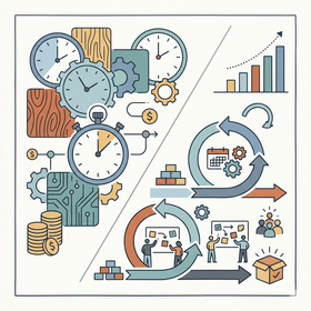
In the high-stakes world of digital product development, the only constant is change. Traditional fixed-scope contracts often act as a straightjacket, preventing teams from responding to market shifts or user feedback discovered during the build. This is where the strategic advantage of Time and Materials (T&M) models becomes apparent, offering the structural freedom necessary for high-growth companies.

Pivoting product strategy in T&M contracts is not merely about changing direction; it is about leveraging financial and operational flexibility to maximize business value. For product leaders, CX directors, and CTOs, understanding how to navigate these pivots is the difference between a failed launch and a market-leading innovation.

This article explores the mechanics of successful strategic shifts within T&M frameworks. We will analyze how to maintain budget discipline while embracing the "pivot," ensuring that every hour billed translates into a tangible step toward product-market fit.

Read entry
Strategic guide for scaling engineering teams in LATAM with time and materials model.

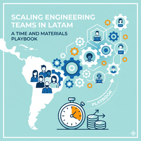
Scaling Engineering Teams in LATAM: A Time and Materials Playbook

For product and technology leaders in highly competitive markets, execution speed is the ultimate differentiator between staying relevant and becoming obsolete. However, local recruitment is often slow and prohibitively expensive, creating significant bottlenecks in the product roadmap. In this landscape, the scaling engineering teams in LATAM: a time and materials playbook emerges as the preferred solution for companies seeking high-quality talent, cultural affinity, and an efficient cost structure.

The Latin American region has evolved from being a "low-cost" option into a strategic hub for global innovation. The central question we address in this analysis is: how can companies implement a scaling engineering teams in LATAM: a time and materials playbook to optimize product delivery and cost efficiency? Understanding the mechanics of this model is vital for scaling without losing control over code quality or team cohesion.

Approaching scaling from a strategic perspective allows B2B, Fintech, and Insurtech organizations to adapt to unforeseen changes in demand without the rigidity of fixed-price contracts. Below, we break down the necessary tactics to ensure this transition becomes an operational and financial success.

Read entry
Senior development team collaborating on a high-scale digital product under a Time and Materials model.

Why the Best Developers Prefer Time and Materials over Fixed Price

In the world of high-stakes digital product development, the choice of engagement model is far more than a financial detail; it is a fundamental driver of project health and final output quality. For product leaders, CX directors, and CTOs, understanding why the best developers prefer Time and Materials over Fixed Price is essential for attracting and retaining the caliber of talent required to build resilient, market-leading solutions.

Fixed Price contracts often promise a sense of security through a locked-in budget and scope. However, for senior engineers and specialized agencies, this rigidity often creates a conflict of interest that pits profitability against technical excellence. In contrast, the Time and Materials (T&M) model fosters a culture of transparency and continuous improvement, allowing teams to focus on solving the right problems rather than just ticking off boxes in an outdated requirement document.

This article explores how the T&M model aligns the incentives of the business with those of the creators. We will examine the hidden costs of fixed scopes—such as technical debt and lack of innovation—and how a flexible approach allows organizations to leverage the full expertise of their partners to drive real business value in an ever-changing landscape.

Read entry
Strategic framework for overcoming cultural barriers in LATAM-US remote collaborations.

Overcoming Cultural Barriers in LATAM-US Remote Collaborations

The shift toward nearshoring has positioned Latin America as the premier partner for US-based technology and design firms. However, many organizations discover that proximity in time zones does not automatically translate to proximity in workplace culture. The friction often arises not from technical inability, but from unaddressed systemic differences in communication, hierarchy, and feedback loops.

For product leaders, CX directors, and CTOs, the challenge of overcoming cultural barriers in LATAM-US remote collaborations is the "last mile" of digital efficiency. Without a deliberate strategy to bridge these gaps, projects face delays, reduced morale, and a lack of authentic innovation. This article explores the deep-seated cultural dimensions that influence these partnerships and provides a roadmap for high-performing, cross-border integration.

Read entry
Remote stand-up management strategies in Time and Materials models for product leaders.

How to Manage Remote Stand-ups in Time and Materials Frameworks: Efficiency and Transparency

Effective remote stand-up management has become the operational nerve center for companies hiring technology and design services under the Time and Materials model. In an environment where every minute invested translates directly into an operating cost, the efficiency of these sessions is not just a matter of agility; it is a matter of financial health and mutual trust between client and provider.

The problem lies in the fact that, without a clear structure, daily meetings in distributed teams often degrade into micro-management sessions or endless status reports that dilute the value of the strategic profile. For product and technology leaders in sectors such as banking or insurance, understanding how to articulate these ceremonies is vital to ensuring that the flow of value does not stop due to communication friction.

How to optimize daily meetings in remote teams under a Time and Materials contract model to guarantee profitability and transparency? This post analyzes the tactics necessary to transform the daily session into an engine for visibility and cost control, ensuring that the investment in remote talent delivers measurable, high-quality results.

Read entry
Comparative chart of productivity and ROI across seniority levels in T&M projects.

The ROI of Senior LATAM Talent in Time and Materials Projects

The ROI of Senior LATAM talent is a critical factor in the management of technology projects and user experience design. Talent selection is often reduced to a simple comparison of hourly rates. Many organizations, pressured by quarterly budgets, opt for teams composed mostly of junior or mid-level profiles, assuming that lower operational costs automatically translate into savings. However, this vision ignores hidden frictions, reworks, and technical debt that emerge when execution lacks strategic depth.

The ROI of Senior LATAM talent is not measured solely by ticket delivery, but by the ability of these professionals to navigate ambiguity and optimize complex business processes. In regions like Latin America, the combination of cultural affinity, timezone overlap, and solid technical training creates a unique scenario for the Time and Materials (T&M) model, where senior efficiency becomes the primary driver of profitability.

Understanding the real question—What is the actual return on investment of hiring senior talent in Latin America under a Time and Materials model?—requires breaking down the impact of seniority on delivery speed, product quality, and risk reduction. In this article, we analyze why paying more per hour can, paradoxically, reduce the total cost of ownership of a digital product.

Read entry
Why 'Time and Materials' Supports Continuous Discovery in Agile

Why 'Time and Materials' Supports Continuous Discovery in Agile

In modern digital product development, uncertainty is not a bug in the system; it is an intrinsic feature of the market. Product and technology leaders often face the paradox of wanting innovative results while operating under rigid contractual structures. The "Fixed Price" model often promises budgetary security but frequently becomes a barrier to the adaptability and deep learning required by UX and true agility.

The success of a product does not depend on how faithfully a plan drawn up six months ago was followed, but on how quickly the team was able to pivot upon discovering that user needs had changed. This is where the relationship between the hiring model and the work methodology becomes critical. Continuous Discovery is not a phase, but a habit, and it requires an environment that does not punish change.

This article addresses the central question: Why is the Time and Materials (T&M) contract model the natural ally for implementing Continuous Discovery in Agile projects? We will explore how this financial structure allows organizations in banking, insurance, and fintech to transition from delivering features to delivering real value, minimizing waste and maximizing competitive relevance.

Read entry